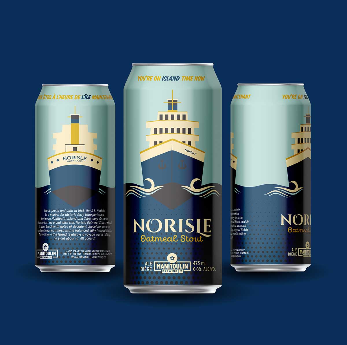
LITTLE CURRENT – The SS Norisle is one of Manitoulin’s iconic images, having plied the waters surrounding Manitoulin from when it entered service as an automobile and passenger ferry in the fall of 1946, bringing thousands of visitors to the Island each season until its retirement in 1974 when the Chi-Cheemaun took over. Since 1975, the vessel has been ensconced on the Manitowaning waterfront as a tourist attraction and now is the namesake of one of the latest offerings from the Manitoulin Brewing Company.
“I’m quite pleased,” said Assiginack Mayor Dave Ham, a long-time champion of the venerable steamship, when informed of the new brew. “It is great to see the old lady recognized as an important part of the Island’s history like this.”
The Expositor caught up with Blake Thompson, lead brewer for the Manitoulin Brewing Company and the person co-owner Blair Hagman called, “the brains and skillsets behind this brew.”
“I’ve always been fond of brewing darker beer such as stouts and porters at home,” shared Mr. Thompson of the inspiration for the recipe for the new stout. “So, when developing the Norisle Stout most of the elements came from a recipe I developed in 2019,” he said. “I chose ingredients that would help me achieve something rich, creamy, roasty and chocolatey. We brewed a test batch last summer, the Island Time Series Oatmeal Stout and we received great feedback from our customers. So, we scaled up that recipe and brewed it a second time.”
Mr. Thompson went on to add, “I love dark beer and I really thought we could use another dark brew in our lineup. Due to the feedback from our test batch, we decided to brand our oatmeal stout and make it part of our beer lineup. As with all of our core product, we tie in the history of Manitoulin Island with our beer. So as a team we tried to think of a local landmark that would match the robust flavour and history of the stout. After consideration, we thought that the SS Norisle steamboat would be a perfect match for our brand new brew.”
The team felt the new beer was worthy of the Norisle name due to its unique attributes. “The wide variety of barley, oats and British hops is what makes this brew standout from the rest,” said Mr. Thompson. “The oats give the beer a velvety mouthfeel, while the barley contributes the sweet, roasty and chocolatey flavours. Norisle stout has the full flavour and texture of a stout, without being overly bitter or astringent—which is why some people say they don’t like dark beer.”
When it comes to pairing the brew with a meal, Mr. Thompson suggests tipplers “try the Norisle next to a steak for some amazing flavour, or if you’re a bit more adventurous try it with raw oysters.” But it isn’t just a full on meal that pairs well with Norisle Stout. “If you’re more into sweets, some hot fudge brownies would make for a great complement alongside this brew,” said Mr. Thompson.

The MBC lead brewer certainly knows his stuff. “I brewed my first beer at home in 2018,” he said. “I loved the craft and quickly honed my skills in it. I started working in a brewery while I still lived in southern Ontario and enrolled in a brewmaster program to deepen my knowledge of the craft. After working up a good reputation in the brewing industry I was hired as the head brewer here at MBC. Working in a brewery really isn’t like any other job out there. It really is a unique feeling to create something brand new and be able to share that with the community.”
“We’d like to give a big thank you to Kendra Edwards (of Kendra Edwards Design) for another fantastic job designing our can graphics,” said Mr. Thompson. “With the Norisle Stout she once again captured everything we wanted compact into a 473mL can.”
“The overall design incorporates a nautical feel and provides a view of the bow on the front of the can and the stern on the back of the can,” said Ms. Edwards. “A darker aesthetic compliments the dark, silky hoppy notes of the oatmeal stout. The typography chosen is a seafaring serif with decorative details in addition to a strong script with thick scrolling penmanship complimenting the serif.”
“If you’re looking to get your hands on some, it’s available through our retail store and online shop,” said Mr. Thompson. “We’re also hoping to have it listed in the LCBO for next winter as a seasonal release.”


