MANITOULIN—A winning entry has been selected for The Expositor Office’s logo contest for an Island motif that can help brand Canada’s 150th anniversary events on Manitoulin Island this year.
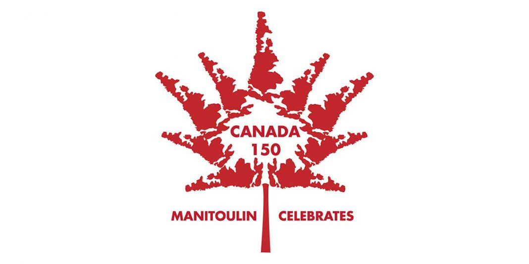
The winning entry was submitted by Wes Newburn of Kagawong. Mr. Newburn’s design is an all-red stylized maple leaf with the elements of the leaf (its points) reflecting a series of Manitoulin Island outlines. As the leaf’s centre is the Canada 150 branding, also in red type, and, flanking the leaf’s stem, the words ‘Manitoulin Celebrates’ in the same type face (and also in red) as ‘Canada 150.’
The judges, in choosing Mr. Newburn’s design as appropriate to brand print advertising material and posters relating to the events this year, also thought that the device could be used to localize individual events and that their locales could be shown below ‘Manitoulin Celebrates’ as an additional line, for example, as ‘In Tehkummah,’ ‘In M’Chigeeng,’ or ‘In Kagawong,’ etc.
Second place honours go to Lyle Dewar of Providence Bay for his ‘Circles of Communities’ entry that superimposes an interlocking two part ‘friendship knot’ on a Manitoulin Island graphic and the seven small red maple leaves atop the knot are there to represent the interconnectedness of the First Nations and non-First Nations communities on Manitoulin.
Third place is a tie as very similar designs were received from Rebecca Dawson of Providence Bay, Matthew Waindubence of Sheguiandah First Nation and Sandra Sampson of Sheshegwaning First Nation.
All of the designs feature a black line-drawn outline of Manitoulin with aspects of the Canadian flag superimposed on it in red: the far West End of Manitoulin is red, there is a red maple leaf motif across the centre of the land and another red band the length of Manitoulin’s easterly reaches. As with Canada’s flag, white swaths of Manitoulin vertically separate the red elements.
There were many more submissions, 28 in all, each one unique and the staff at The Expositor Office and the judging panel were impressed by the range of imaginative material.
Every entrant will receive a t-shirt with the winning logo printed on it and the winners will receive a cash prize: $300 for first place, $150 for second place and a shared $50 ($20 each) for the trio tied for third place. (A $50 sum divides awkwardly into three so there is a bonus here in the interest of arithmetical neatness and no pennies.)
The idea of the logo contest, Expositor publisher Rick McCutcheon noted, was to have a common identifying theme to show in the advertising of all Canada 150 events on Manitoulin this year.
The winning design is available for all municipalities, First Nations, service clubs, businesses, etc. to use as a common identifier for all Canada 150 events on Manitoulin Island, Mr. McCutcheon noted.
It will be shown on the newspaper’s website, www.manitoulin.ca, and anyone needing it can access it there or they can contact The Expositor Office at 705-368-2744 or by email at expositor@manitoulin.ca to arrange to have it sent on.
Many will recognize logo contest winner Mr. Newburn’s design from the Manitoulin-inspired Christmas ornaments sold each year at Christmas markets across the Island—Christmas 2016 marked his 20th anniversary as a designer.
Mr. Newburn explained that his neighbour, Mike Free, encouraged him to enter the logo contest, so he did.
“I thought it was a pretty good fit,” he said of his design.
Mr. Newburn said he was “very pleased” with the news he had won. “My wife was very happy to see that email come across.”
The Expositor also sent Mr. Newburn an attachment that included a digitized copy of his idea, rendered for print use, but he was unable to open it. He was patiently awaiting this week’s edition to see it for the first time.


